In going through the process of re-branding Sparrow Ink Design, I've done a lot of thinking and research about branding and how businesses can use it most effectively. One thing that comes up over and over again with clients is that they feel their customers may be tired of seeing the same type of image or text treatment over and over again. I wholeheartedly believe that this is untrue. Graphics do need to be varied for interest - but it's imperative to do so within the safe parameters of the brand.
To keep customers engaged and interested many feel the need to vary their visual presence and use a wide range of flashy graphics, vary the fonts and colors. This strategy, while sounding effective, often backfires. Humans are creatures of repetition and routine. We find comfort in the known and while intrigued by the unknown, we often stick to - and put our money in - what we know and trust.
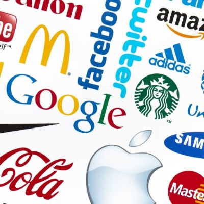
Brand recognition is essential to business. Your social media, email, website, print, and in-store signage all work together to create an experience for your customers. When you look at some of the most successful brands, you find lots of repetition and consistency. Apple has a certain aesthetic that is recognizable even without their signature logo. Same with companies like Starbucks, Target, Coca-Cola and the like. You can often tell what promo piece belongs to what company even without the logo because of the consistency in colors, fonts and overall treatment of the images. We as customers, see this and feel comfortable patronizing those businesses because we like the consistent experience they provide. If Starbucks suddenly started using purple straws instead of their signature green, it would confuse and frustrate people. (Remember when Gap tried to drastically change their logo: http://adage.com/article/behind-the-work/gap-wrong/146393/)
You many be bored of the same style of graphic, but your customers are not! A business owner sees a very saturated version of their business' visual identity day in and day out and therefore, may feel like everything always looks the same. Your customer's see pieces of your brand here and there mixed in with other brands and media. Seeing the same styles and colors associated with your name creates a positive association along with good experiences with your business that will bring your customers back again and again.
The best way to be sure that people feel confident in your business is to utilize a consistent brand. Sticking to a designated color pallet, fonts and overall style of imagery is not boring repetition, but intentional branding.